Pop Social Inc.
Client: Pop Social
Role: UI/UX Intern
Skills: User Research, Product Thinking, Content Strategy
Team: Arely Mancia, Ruochen Wu, Audrey Webb
How can we streamline onboarding and introduce the chat functionality simultaneously?
As a UI/UX Intern, I had the opportunity to work with one other designer to develop the application’s tutorial intercom feature. We needed to iterate on a solution that focused on introducing the chat function, while also onboarding members on the platform.
Background
Pop Social is a start-up based in Austin, TX, focused on easing the process of making and maintaining friendships in college. They recognize the difficulties that come with adjusting to a new environment, and seeks to provide an organic way to meet fellow students to help them feel more at home. The application is focuses on helping students forge relationships based on mutual interests and personality traits. Until users begin a conversation, they can not see their real names or pictures of each other.
The Challenge
Many members did not finish onboarding, thus preventing them from making friends and utilizing the app. We needed to combine parts of onboarding to streamline the process, but figure out a way that still introduced every feature.
Research
Before we began designing, we needed to understand the constraints from previous iterations. After several discussions with the data team and interviews with existing users, it became clear that onboarding needed to be updated. There were many comments from users, such as being overwhelmed with how lengthy getting setup took and not understanding that the purpose of the chat functionality in the previous tutorial. For Pop, not setting this up would mean fewer requests sent and less time spent on the app. Additionally, the data team showed that a several users did not complete onboarding.
“26% of users did not finish onboarding”
- Rick, Data Analytics Team
yellow “null”, shows users that did not complete onboarding
To get a better idea of how users were feeling, our team conducted 8 in-depth user interviews, where we sought to understand users’ goals when using the app, their experience getting set-up, and how they felt constrained.
Ideation
Based on the interviews and discussions with the data analytics team, we first needed decide what we needed to change.
INSIGHTS:
The grayed out screens from previous iterations cheapened the product and lengthened onboarding unnecessarily
Introducing the mascot too early on was overwhelming and distracting for users
Combining the swipe card feature of tutorial and getting your profile set up was frustrated users, as there was too much going on
Many users expressed not loving how much pochi (the mascot) appeared and the colors being too saturated and hurting their eyes
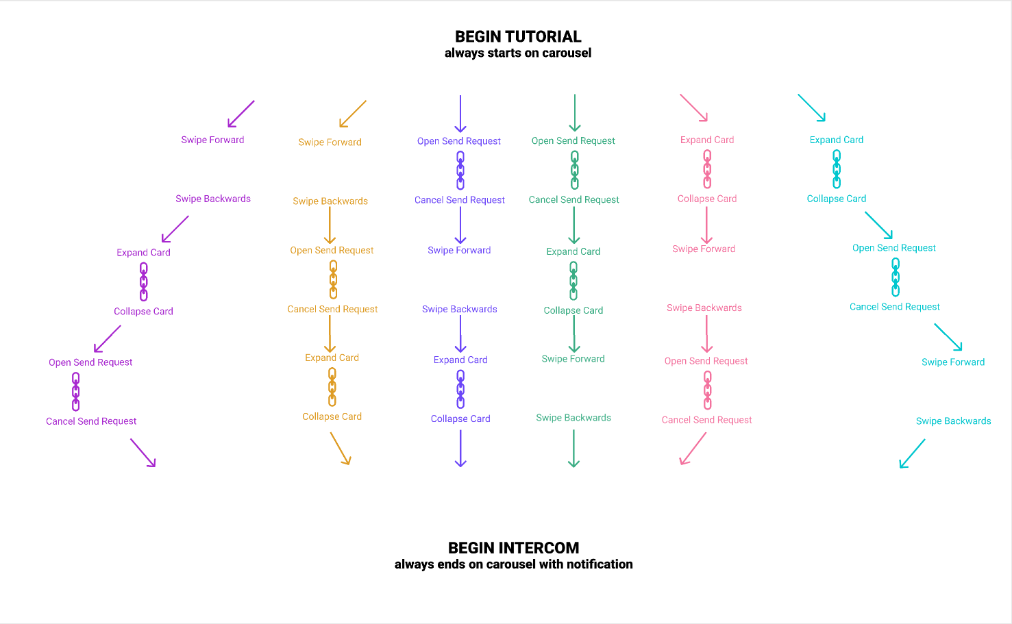
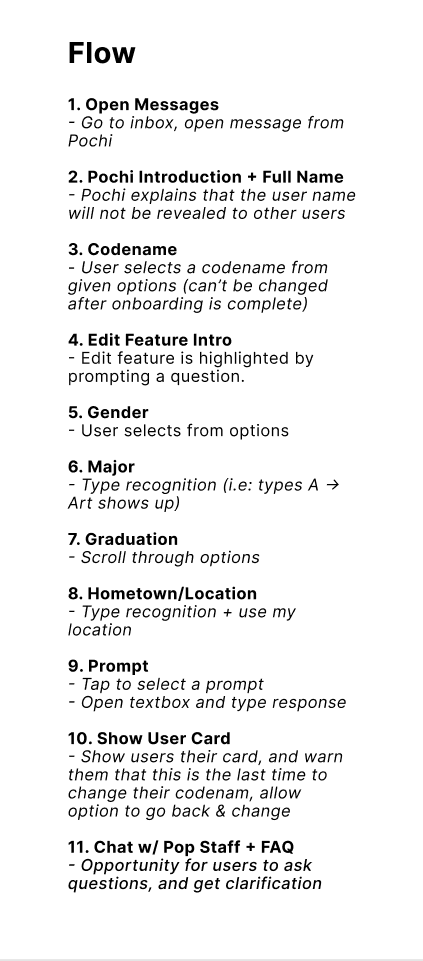
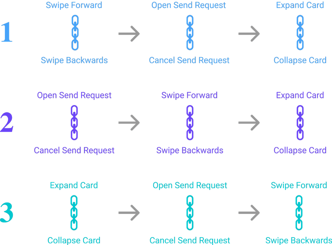
below is the original information architecture that the previous team of designers used, our new intercom flow, and the updated onboarding flow. after analyzing our data and interviews, my team split tutorial into two sections: onboarding which focused on showing users the swipe card function and intercom focused on introducing the chat functionality and situating users. from here the team divided into pairs; arely and I worked on intercom and developed a flow for what information needed to be collected during the conversation and how we planned to communicate that this was a place to ask questions.
Design
After deciding we needed to separate tutorial onboarding from intercom and developing a flow, we were ready to start designing!
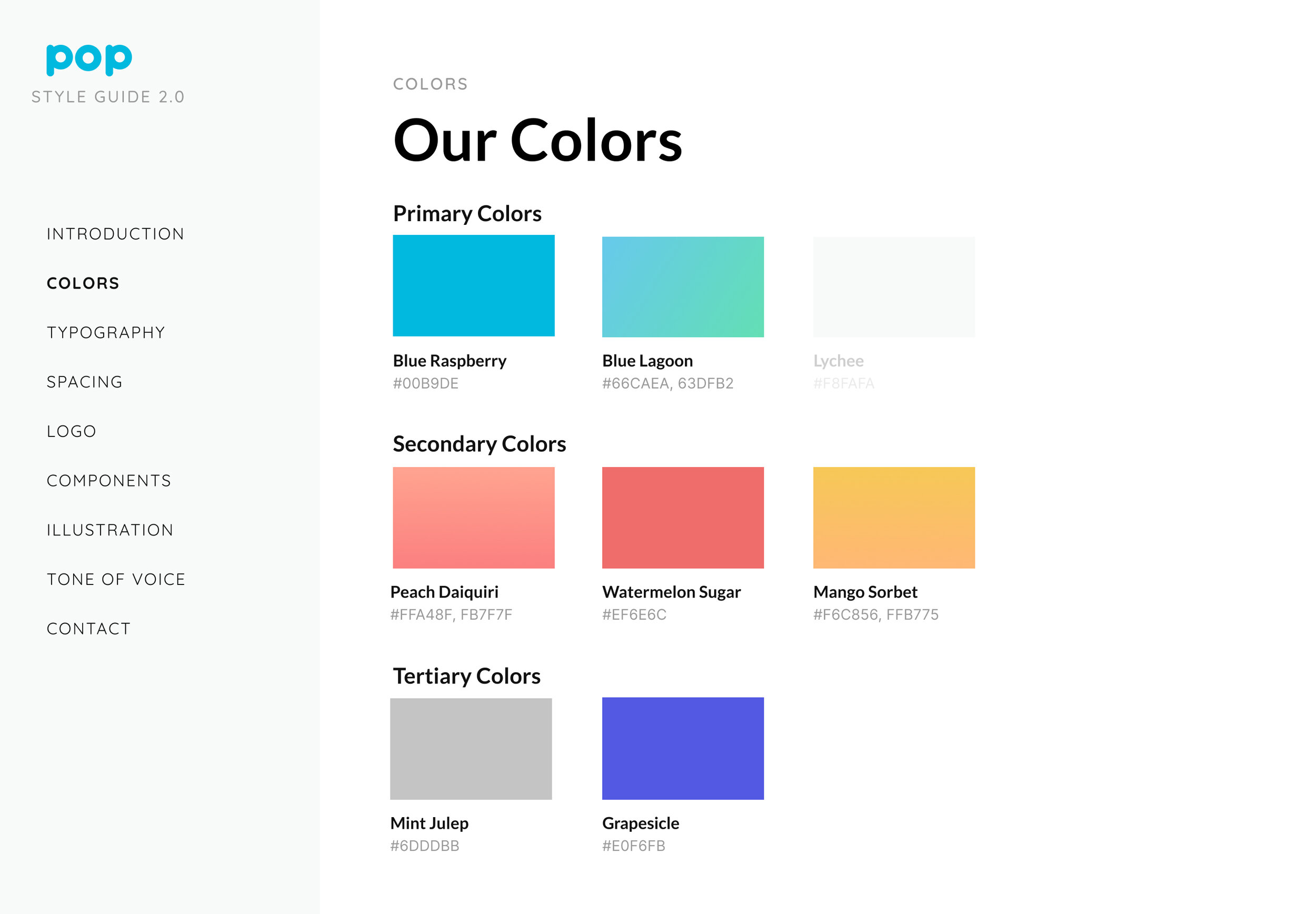
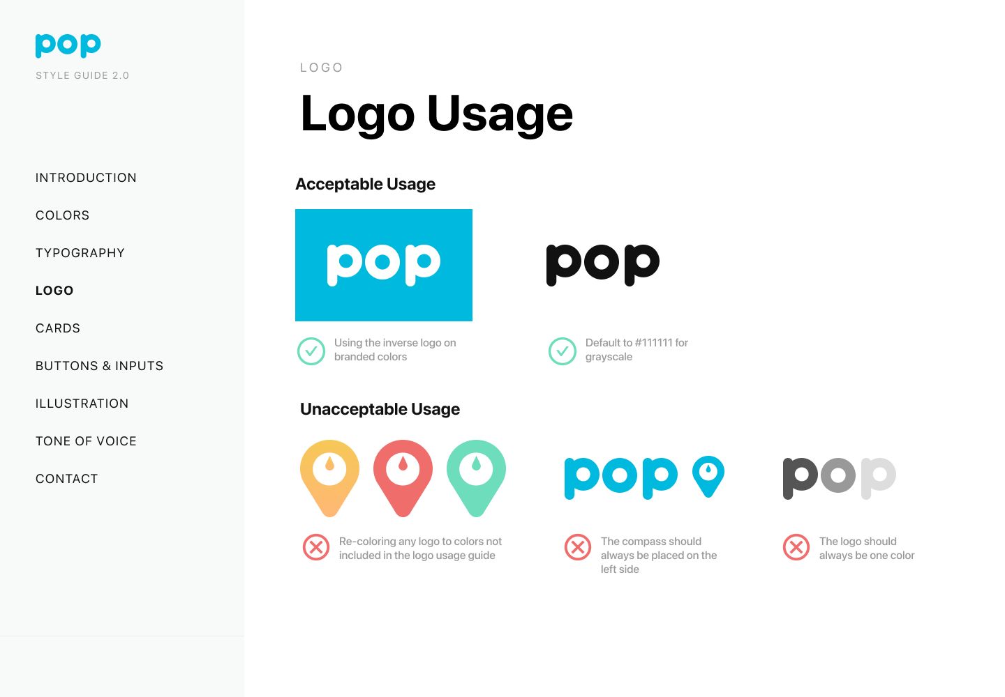
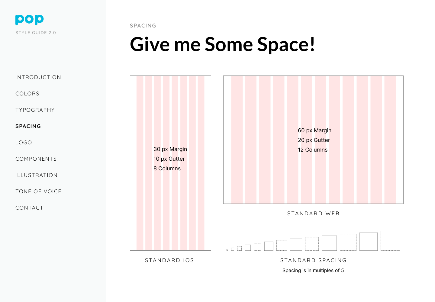
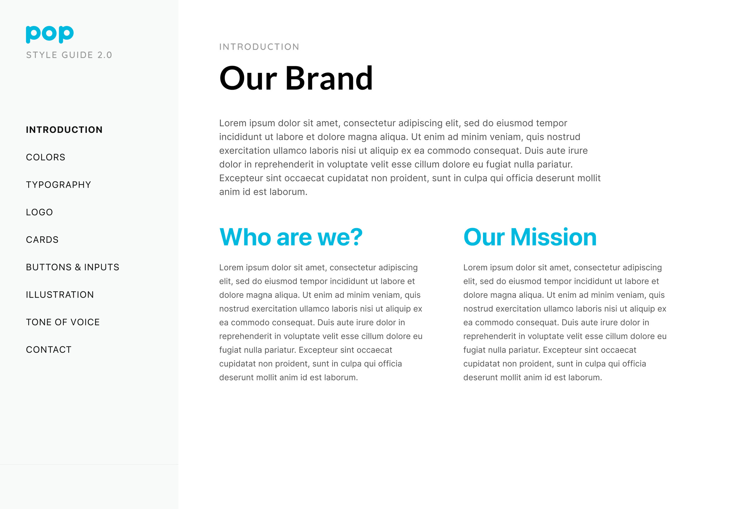
Below you can view our efforts to re-brand. The first thing our team worked on was addressing some of the concerns to the color scheme and mascot. We worked on re-branding through developing: a less saturated color scheme, opting for an updated san serif font and logo, solidifying the brand statement (partnered with the marketing team), and standardizing the text and spacing needed throughout the application.
IMPORTANT CHANGES:
integrated situating members on the app (getting them to build their profile), while introducing them to the chat feature
added a tap on message to edit feature to streamline the UI
worked with dev team to develop type to text and tap features to accelerate time spent on intercom
brought all of onboarding/intercom down from 6 minutes to 1 minute and 13 seconds.
Intercom Preview
without further ado, we present to you: a snapshot of intercom!
What I Learned
I really enjoyed working at Pop, and often found myself wishing I had app like such, while I was a freshman in college.
Over the course of my four months I learned that:
Documentation is super important! In a fast moving start-up there is always new and exciting ideas, what’s important is keeping track of them and ensuring that there is material to reference when a new iteration needs to be developed.
Work with teammates toward a common goal, and check-in frequently to make sure you are on the same page. Having daily check-ins and calls, just to update each other (even if we hadn’t done anything that day!) improved communication and ensured that we all wanted to take the app in the same direction. It also jut helped to have a written record in our chat of what we had worked on.
Taking notes for each screen is useful, because it helps keeps track of the purpose and notes for content strategy.
Additionally I learned that it is easy to get caught up in what you as the designer thinks is intuitive, thus making it even more important to follow-up with current and potential users to ensure that each feature is usable and is helping the user feel comfortable using the app.


